ACRE Consultancy.
Independent chemical regulatory consultancy guiding manufacturers, importers, formulators, and distributors worldwide through UK REACH and EU REACH compliance.
Independent chemical regulatory consultancy guiding manufacturers, importers, formulators, and distributors worldwide through UK REACH and EU REACH compliance.
Based on the edge of the New Forest, ACRE had grown through referrals and needed a brand and website that reflected its expertise and could generate new enquiries.
We refreshed ACRE's brand and designed a bespoke website, then rolled the new identity out across brand guidelines, presentation and LinkedIn templates, business cards, and exhibition stand artwork.
The result is a confident, professional brand presence, launched across print, digital, and event materials in time for ACRE's first major exhibition at CHEMUK 2026.
We designed and developed a bespoke WordPress website to help ACRE grow beyond referrals, presenting its specialist regulatory services clearly and supporting its LinkedIn and event activity.
An Insights section for regulatory guidance, FAQ sections across the main service pages, and structured data throughout the site lay the foundations for ACRE's visibility on UK REACH and EU REACH topics.
The layout is deliberately clean and uncluttered, with woodland footage and the tree-ring graphic device leading the imagery, so a complex subject feels approachable.
Compliance can feel overwhelming, so the design avoids the cluttered layouts common across the sector, pairing a clean structure with off-centre tree rings and woodland imagery. A mega menu with a short description under every service helps visitors who arrive with a problem, rather than a service name, find the right starting point.
Fully responsive across mobile, tablet, and desktop, the site keeps the menu, service pages, and enquiry form clear on smaller screens, while the hero video falls back to a poster image on slower connections.
User Experience
A descriptive mega menu, grouped service landing pages, and well-structured service pages guide visitors from their regulatory challenge to the right support and a simple enquiry.
Mobile Responsive
Navigation, service pages, FAQs, and the enquiry form were built to stay legible and usable across mobile, tablet, and desktop, with WebP images and a light script footprint keeping pages lean.
Interactive Design
A looping woodland hero video, a closing call-to-action video, and a header logo that switches to the compact mark on scroll add movement and polish without distracting from the content.
We evolved ACRE's original logo into a modern, timeless identity that keeps the meaning behind it while signalling experience and trust in a highly technical field.
The visual system combines a refined wordmark, a tree-ring graphic device inspired by ACRE's New Forest roots, and a teal-led palette with an orange accent used sparingly.
The palette leads with Dark Teal, Mid Teal, and Light Teal, supported by Soft White, to create a calm and dependable foundation. A bold orange accent is reserved for highlights and calls to action, so it draws the eye where it matters across print and digital materials.
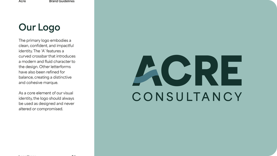


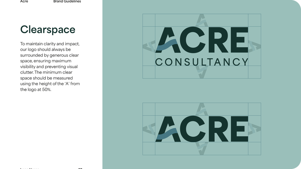
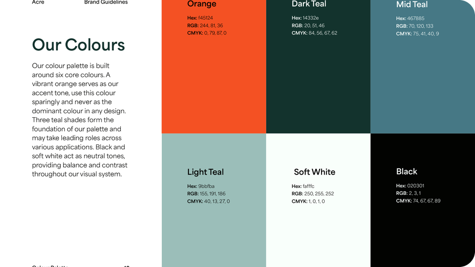
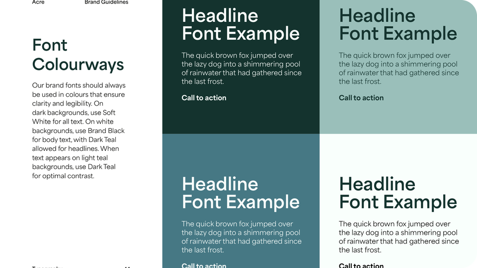
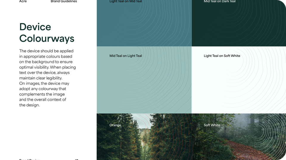
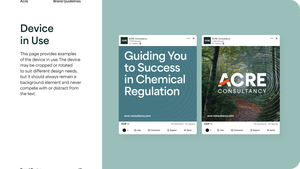
We developed digital and print brand guidelines to ensure consistency across logo usage, typography, colour application, the tree-ring graphic device, and supporting brand assets.
Logo
The curved sweep of the A gives the wordmark a distinctive, modern detail drawn from ACRE's original logo, with refined letterforms set at an equal height so it reads like a stamp. The full version keeps the Consultancy sub line to set ACRE apart from similarly named businesses, while a compact mark works at smaller sizes.
Typeface
A single primary typeface sets a consistent hierarchy, with Bold for headlines, Regular for body text, and Extra Bold for calls to action, while Instrument Sans is specified as a free alternative.
Colour Palette
Three teals and Soft White give the brand a steady, assured foundation, while a bold orange accent adds energy to highlights and calls to action.