Veblen International.
Global beauty recruitment and headhunting agency placing talent from entry level to C-suite across beauty, aesthetics, technical, women's health, wellness, and lifestyle brands.
Global beauty recruitment and headhunting agency placing talent from entry level to C-suite across beauty, aesthetics, technical, women's health, wellness, and lifestyle brands.
Veblen International, the beauty division of the Kinetica Group, needed its ageing website to feel modern, premium, and aspirational without ever looking like a beauty retailer.
We refreshed the brand's colour palette, typography, and imagery, then designed and built a bespoke WordPress website with a live job board, a self-updating placed roles portfolio, and a filterable Insights hub.
The result is an editorial, luxury-led platform that showcases Veblen's expertise from the lab to launch and gives clients and candidates a clear path to the right sector, service, or role.
We designed and developed a bespoke WordPress website that presents Veblen as a partner across the whole product lifecycle, from formulation and regulatory roles through to commercial, marketing, and executive leadership.
The structure is built around six sector landing pages, four service pages, a live job board, and an Insights hub, with several drafts of copy consolidated into one SEO-led version. The copy was written in American English to support Veblen's growth in North America.
Veblen's team manages live roles, placements, consultant assignments, and articles day to day in the WordPress back office, following hands-on training sessions.
The design takes a restrained, editorial approach, with clean white space, warm neutrals, straight-cut edges, and abstract imagery of stone, water, petals, and glass in place of product shots. This allows one look to appeal equally to founder-led start-ups, mid-size brands, and global beauty houses.
On mobile, job search filters, application forms, and the sector video slider remain clear and easy to use, with lazy-loaded media and a lightweight theme keeping pages fast on smaller screens.
User Experience
Clear sector and service navigation, a searchable job board, and dedicated forms for CVs, vacancies, and client briefs make it easy for clients and candidates to take the right next step.
Mobile Responsive
Job search, CV uploads, vacancy and briefing forms, and Insights filtering were optimised to remain clear and easy to use across mobile, tablet, and desktop devices.
Interactive Design
An 'Our sectors' slider of six looping videos on the homepage, from a lavender field to rose petals and an aerial beach, loads each video only when needed behind lightweight poster images so the page stays fast.
We refreshed Veblen International's brand around the idea of premium through restraint, keeping the existing V logo and introducing a new colour palette, typography system, and imagery direction.
The visual system pairs a single Dark Cherry accent with warm neutrals, generous white space, and classic editorial typefaces, so the brand feels luxurious and credible while staying understated.
The palette pairs Dark Cherry, with a lighter cherry tint for highlights, against Almost Black text, Beige and Refined Beige backgrounds, and a muted Green used sparingly. Together they give Veblen a rich, editorial look that stays consistent across the website and LinkedIn.
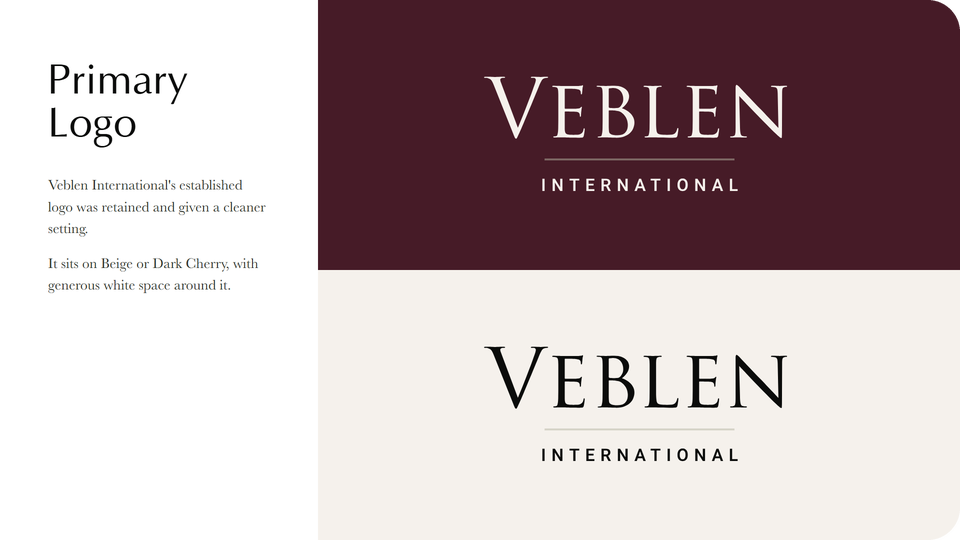
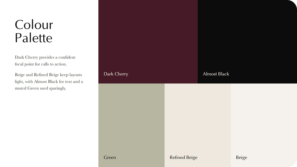
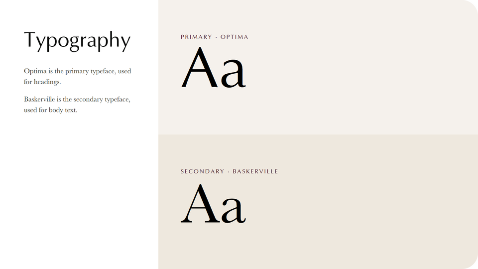
Typography and colour palette guidelines give Veblen's team a clear reference for applying the refreshed identity consistently across the website and social media.
Logo
The established Veblen International V logo was retained at the client's request and now sits within a cleaner layout of generous white space, warm neutrals, and editorial typography.
Typeface
Optima is the primary typeface, used for headings to give the site a refined, editorial luxury feel, while Baskerville is the secondary typeface for body text, adding a classic serif elegance.
Colour Palette
Dark Cherry provides a confident focal point for calls to action, balanced by Beige and Refined Beige neutrals, Almost Black text, and a muted Green used sparingly.