Roberts Law.
Specialist commercial debt recovery and debt litigation law firm focused on corporates in utilities, telecoms, and fintech, as well as professional services firms and SMEs.
Specialist commercial debt recovery and debt litigation law firm focused on corporates in utilities, telecoms, and fintech, as well as professional services firms and SMEs.
As a single-practice debt recovery specialist, Roberts Law needed a brand and website that would stand out as the premium choice in a market dominated by large multi-practice firms.
We developed a full brand identity built around a distinctive arrow marque and a bespoke website with a transparent cost calculator, then rolled the brand out across LinkedIn, print, and office signage.
The result is a fresh, premium presence that feels both modern and established, carried consistently from the website through to the client portal and everyday correspondence.
We designed and developed a bespoke WordPress website for Roberts Law that opens with full-width footage of the London skyline, setting a confident tone from the first screen.
Eight service pages and three sector pages explain how the firm supports utilities, commercial, and financial clients, with team profiles and FAQs consolidated under About to keep navigation simple.
A cost calculator shows how interest and statutory late payment compensation can offset fees, while full pricing details sit on a dedicated SRA Transparency Rules page, keeping the homepage focused on corporate clients.
The design brings together the energy of a disruptor and the credibility of an established firm, using London skyline footage to anchor the brand in the UK. A frosted-glass header, slanted section cuts that echo the logo, and a faint city outline behind the services section add distinctive detail throughout.
On mobile, a separate version of the hero video keeps the London skyline front and centre, while the services, sectors, and enquiry journey remain clear and easy to use.
User Experience
Clear service and sector pages, About content consolidated with anchor links, and FAQ tabs on the contact page guide visitors from understanding the firm's expertise to making an enquiry.
Mobile Responsive
Layouts, the dedicated mobile hero video, the cost calculator, and the enquiry form adapt cleanly across mobile, tablet, and desktop devices.
Interactive Design
Service and sector cards bring in the marque and tinted brand colours on hover, while the cost calculator gives a clear, stage-by-stage view of what a recovery could return.
A complete brand identity was crafted to give Roberts Law a clean, corporate look, avoiding traditional legal imagery in favour of a single, meaningful marque.
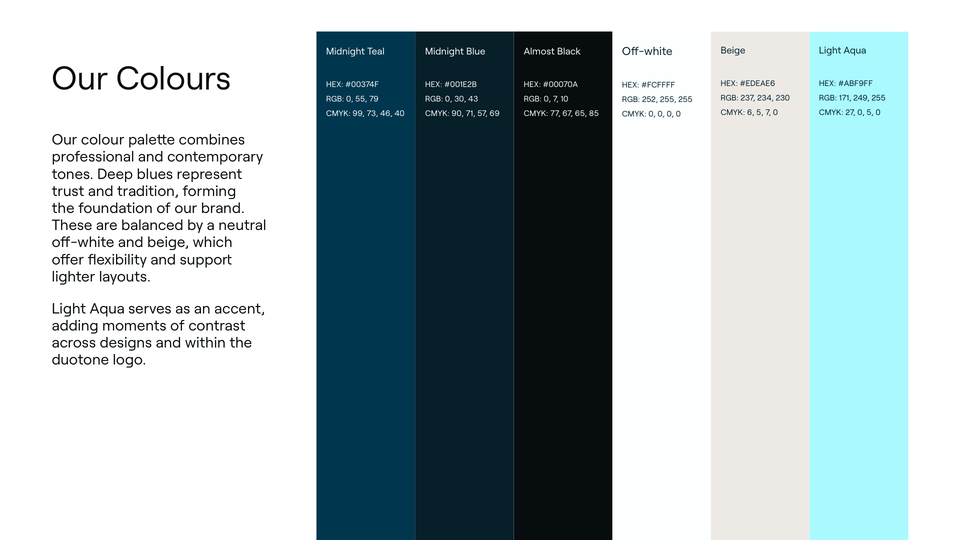
The visual system combines the arrow marque, a refined serif wordmark, and a palette of deep blues lifted by a Light Aqua accent.
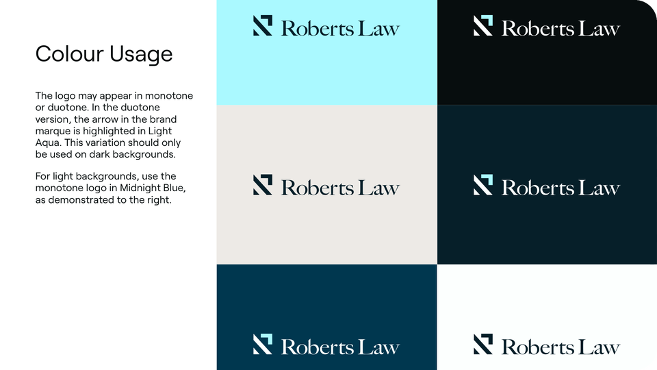
The palette sets Midnight Teal and Midnight Blue against Off-white and Beige, with Light Aqua as an accent for contrast. Because the brand also has to help get debts paid, colour is reserved for marketing, social, and web, while a monotone logo keeps formal letters to debtors clear and serious.
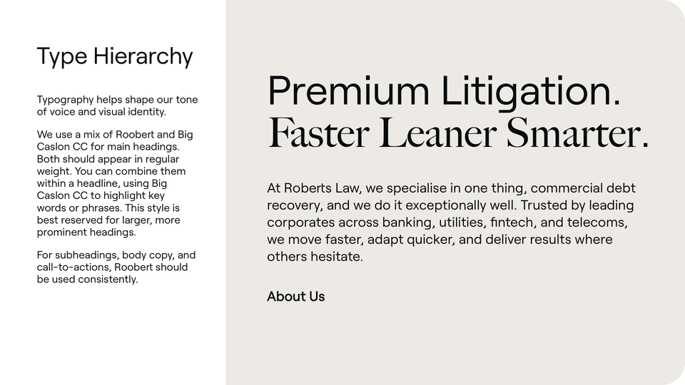
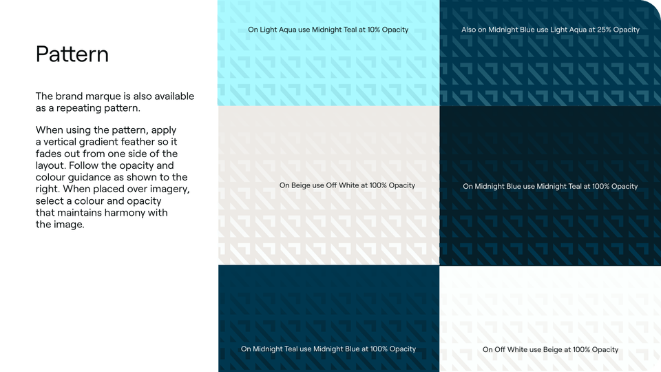

We developed digital and print brand guidelines covering logo versions and clear space, typography hierarchy, colour application, and the brand pattern, supported by a social media toolkit.
Logo
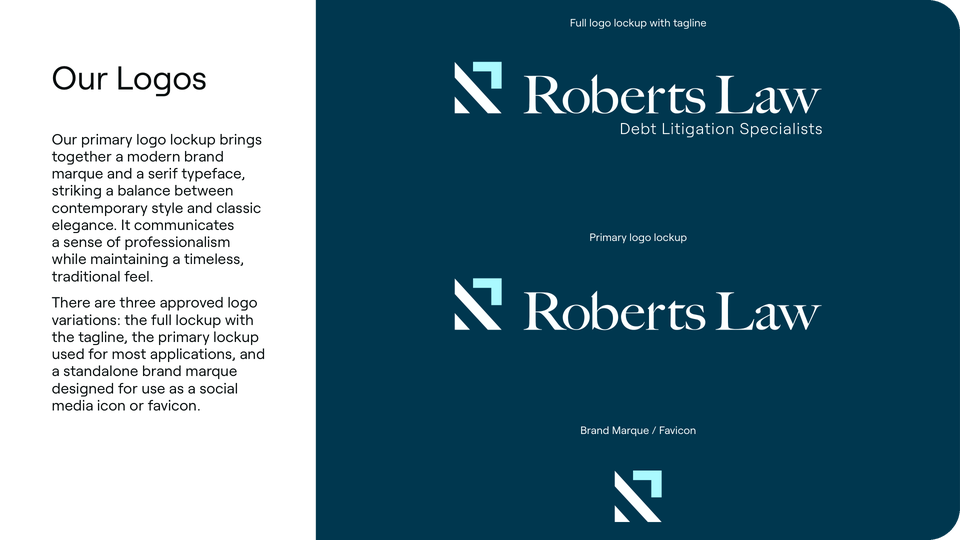
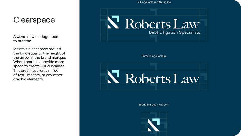
The primary lockup pairs the arrow marque with an elegant serif wordmark. Three approved versions cover the full lockup with tagline, the primary lockup, and a standalone marque, with clear space set by the height of the arrow.
Typeface
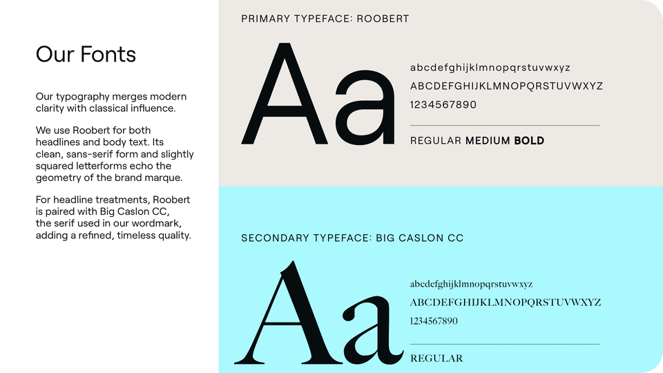
Roobert is used for headlines and body copy, its slightly squared letterforms echoing the geometry of the marque, while Big Caslon CC, the serif from the wordmark, highlights key words in large headings.
Colour Palette
Midnight Teal and Midnight Blue convey trust and tradition, Off-white and Beige keep layouts light, and Light Aqua picks out the arrow in the duotone logo, which is reserved for dark backgrounds.